Getting Started
The ConnectyCube Web Chat Widget is designed to simplify the process of adding chat functionality to your Web apps. This widget offers an out-of-the-box solution for embedding chat features - such as instant messaging, user presence, and file sharing - without the overhead of building a complete chat system from scratch. Key benefits include:
- Easy integration: plug the widget into your existing Web projects.
- Customizable interface: adjust the look and feel to match your brand.
- Real-time messaging: leverage ConnectyCube’s reliable backend for instant communication.
- Responsive design: works seamlessly on both desktop and mobile devices.
- Modular and extensible: adapt the widget to your unique requirements.
Code samples
Section titled “Code samples”See chat widget code samples as a reference for faster integration.
Installation
Section titled “Installation”# npmnpm install --save @connectycube/chat-widget
# yarnyarn add @connectycube/chat-widgetAdd the following scripts on your html page somewhere in head element:
<script src="https://unpkg.com/react@18/umd/react.production.min.js" crossorigin></script><script src="https://unpkg.com/react-dom@18/umd/react-dom.production.min.js" crossorigin></script><script src="https://unpkg.com/connectycube@4/dist/connectycube.min.js"></script><script src="https://unpkg.com/@connectycube/chat-widget@latest/dist/index.umd.js"></script># npmnpm install --save @connectycube/chat-widget-angular
# yarnyarn add @connectycube/chat-widget-angularAs this component uses wrapped @connectycube/chat-widget, install types for React and ReactDOM as devDependencies:
# npmnpm install --save-dev @types/react @types/react-dom
# yarnyarn add --dev @types/react @types/react-dom
Display widget
Section titled “Display widget”Before you start
Section titled “Before you start”Before you start, make sure:
- You have access to your ConnectyCube account. If you don’t have an account, sign up here.
- An app created in ConnectyCube dashboard. Once logged into your ConnectyCube account, create a new application and make a note of the app credentials (App ID and Auth Key) that you’ll need for authentication.
Import and place the following component in your app:
import ConnectyCubeChatWidget from "@connectycube/chat-widget";
...
<ConnectyCubeChatWidget  appId="123"  authKey="11111111-2222-3333-4444-55555555"  userId="45"  userName="Samuel"  showOnlineUsersTab={false}  splitView={true}/>
// userName - how other users will see your user name// userId - a User Id from your system
See chat widget code samples as a reference for faster integration.
Detailed YouTube guide how to add ConnectyCube Chat Widget to React app:
React version support
Section titled “React version support”Since v0.35.0, the default build of the widget targets React 19 and is provided as an ESM module. For React 18 projects, use the dedicated ESM-only build:
// v0.35.0 and later:import ConnectyCubeChatWidget from '@connectycube/chat-widget'; // default: React 19import ConnectyCubeChatWidget from '@connectycube/chat-widget/react19'; // explicit React 19 buildimport ConnectyCubeChatWidget from '@connectycube/chat-widget/react18'; // dedicated React 18 build
// v0.34.0 and earlier:import ConnectyCubeChatWidget from '@connectycube/chat-widget'; // default: React 18import ConnectyCubeChatWidget from '@connectycube/chat-widget/react19'; // React 19 build
Vanilla JS
Section titled “Vanilla JS”Place the following script in your app:
<!doctype html><html lang="en"> <head> <!-- ... --> </head> <body> <!-- ... --> <!-- @connectycube/chat-widget - start --> <script src="https://unpkg.com/react@18/umd/react.production.min.js" crossorigin></script> <script src="https://unpkg.com/react-dom@18/umd/react-dom.production.min.js" crossorigin></script> <script src="https://unpkg.com/connectycube@4/dist/connectycube.min.js"></script> <script src="https://unpkg.com/@connectycube/chat-widget@latest/dist/index.umd.js"></script> <script> const chatWidgetContainer = document.createElement('div'); chatWidgetContainer.id = 'ConnectyCube_chat-widget'; document.body.appendChild(chatWidgetContainer); const props = { appId: 123, authKey: '11111111-2222-3333-4444-55555555', userId: '45', // a User Id from your system userName: 'Samuel', // how other users will see your user name showOnlineUsersTab: false, splitView: true, }; ReactDOM.createRoot(chatWidgetContainer).render(React.createElement(ConnectyCubeChatWidget, props)); </script> <!-- @connectycube/chat-widget - end --> </body></html>See chat widget code samples as a reference for faster integration.
Detailed YouTube guide how to add ConnectyCube Chat Widget to Vanilla JS app:
Angular
Section titled “Angular”Import and connect the ConnectyCubeChatWidgetComponent to your component (e.g., in app.ts):
import { RouterOutlet } from '@angular/router';import { ConnectyCubeChatWidgetComponent } from '@connectycube/chat-widget-angular';
@Component({  selector: 'app-root',  imports: [RouterOutlet, ConnectyCubeChatWidgetComponent],  templateUrl: './app.html',  styleUrl: './app.css',})export class App {  ...  protected readonly connectycubeChatWidgetProps = {    appId: 111,    authKey: '11111111-2222-3333-4444-55555555',    config: { debug: { mode: 1 } },    userId: '112233', // a User Id from your system    userName: 'Samuel', // how other users will see your user name    showOnlineUsersTab: false,    splitView: true,  };}
Place the <connectycube-chat-widget /> component in your template (app.html) and pass the props:
<div id="app"> ... <connectycube-chat-widget [props]="connectycubeChatWidgetProps" /></div>...Feature configuration
Section titled “Feature configuration”This section explains how to control specific features of the chat widget by enabling or disabling them through configuration props. Customize your widget behavior to meet your specific requirements without having to modify the core code.
Notifications
Section titled “Notifications”This section allows you to configure how users are notified about new messages. You can control notifications, browser push notifications, and notification sounds independently for a fully customizable experience:
- showNotifications - show browser notifications about new messages received
- webPushNotifications - show browser push notifications about new messages received
- playSound - play sound about new messages received
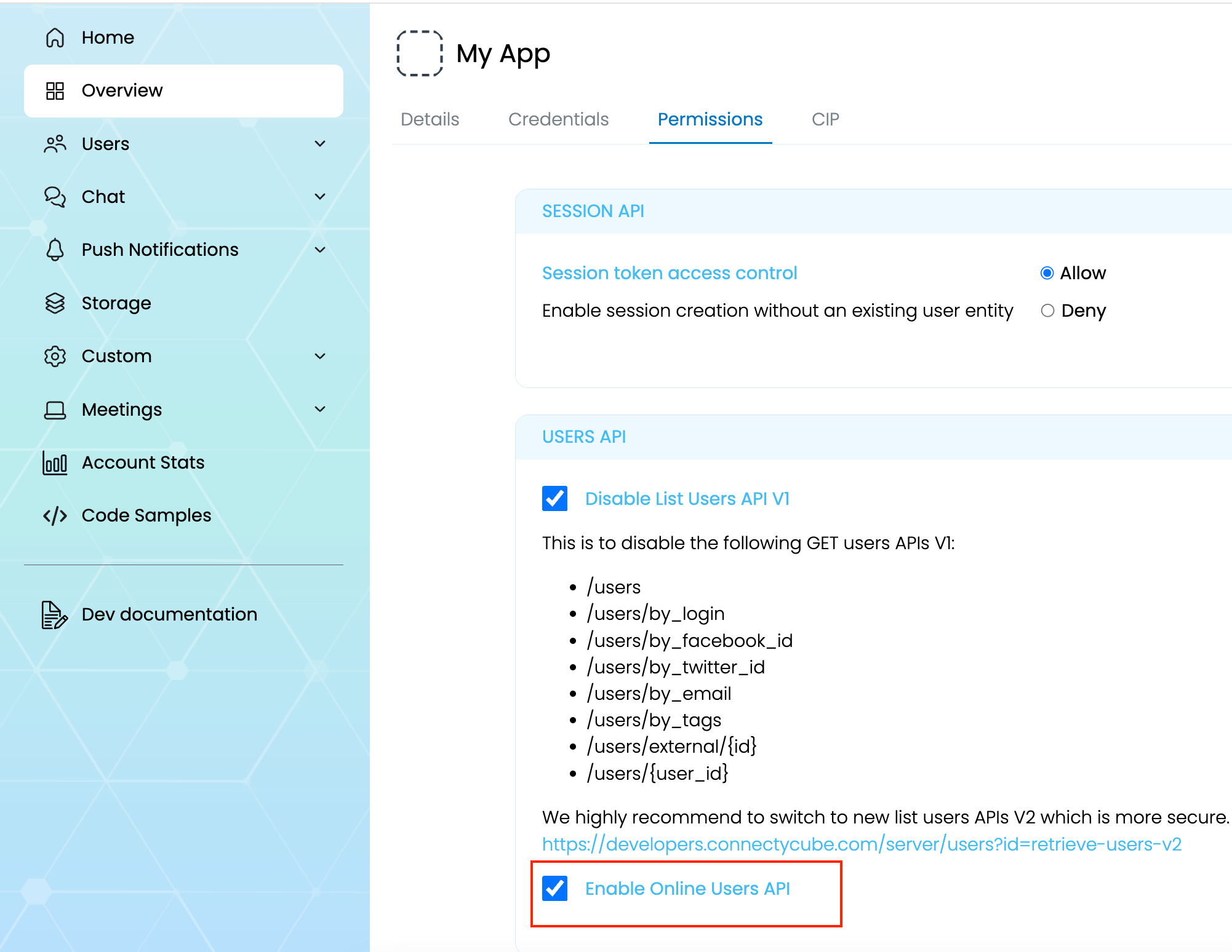
Online users
Section titled “Online users”We can displays a dedicated tab within the chat widget that lists all currently online users. This feature is useful in team or community-based chat environments where it’s helpful to see who’s available before starting a conversation.
<ConnectyCubeChatWidget ... showOnlineUsersTab={true}/>const props = { ... showOnlineUsersTab: true,};@Component({ ... })export class MyComponent { props = { ... showOnlineUsersTab: true, };}To make this feature work you also need to enable Online Users API in ConnectyCube Daashboard in your app’s permissions
Toggle Button visibility
Section titled “Toggle Button visibility”hideWidgetButton - controls the visibility of the floating button that users click to open or close the chat widget. This is useful when you want to launch the widget programmatically or embed it inside a custom UI element instead of showing the default button. Read how to open a widget by clicking on custom button
New chat buttons
Section titled “New chat buttons”These settings let you control whether users can start new chats or initiate one-on-one conversations. Use them to restrict chat creation in specific environments or use cases, such as read-only communities or customer support-only contexts.
- hideNewChatButton - controls the visibility of the main “New Chat” button in the chat widget interface.
- hideNewUserChatOption - hides the option to start a new 1-on-1 conversation from within the “Create Chat” flow. This is useful when you only want to allow group chats or predefined channels.
Moderation
Section titled “Moderation”The moderation settings help maintain a safe and respectful chat environment. These options allow users to report inappropriate content and manage their personal block lists, giving them more control over their experience.
At then moment the following moderation features supported:
- enableContentReporting - users can report messages via a UI action
- enableBlockList - users can block and unblock others from their profile
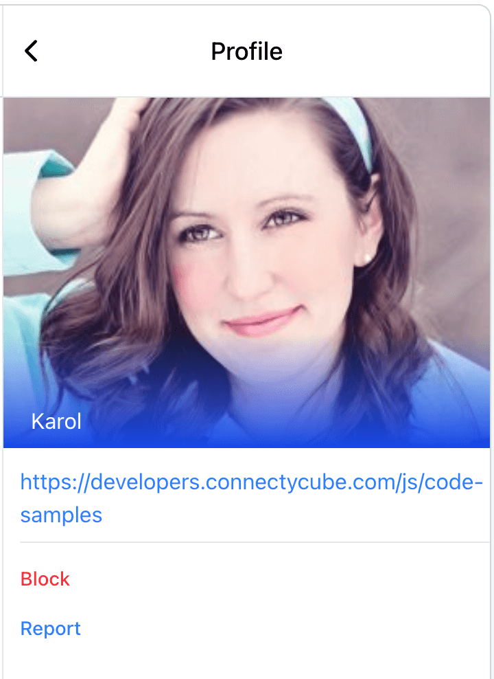
Report user
Section titled “Report user”To enable Report user feature, you need to pass enableContentReporting: true prop. This will display a Report button in user profile:
For user reporting to work properly, it requires the following:
- Go to ConnectyCube Daashboard
- select your Application
- Navigate to Custom module via left sidebar
- Create new table called UserReports with the following fields:
- reportedUserId - integer
- reason - string
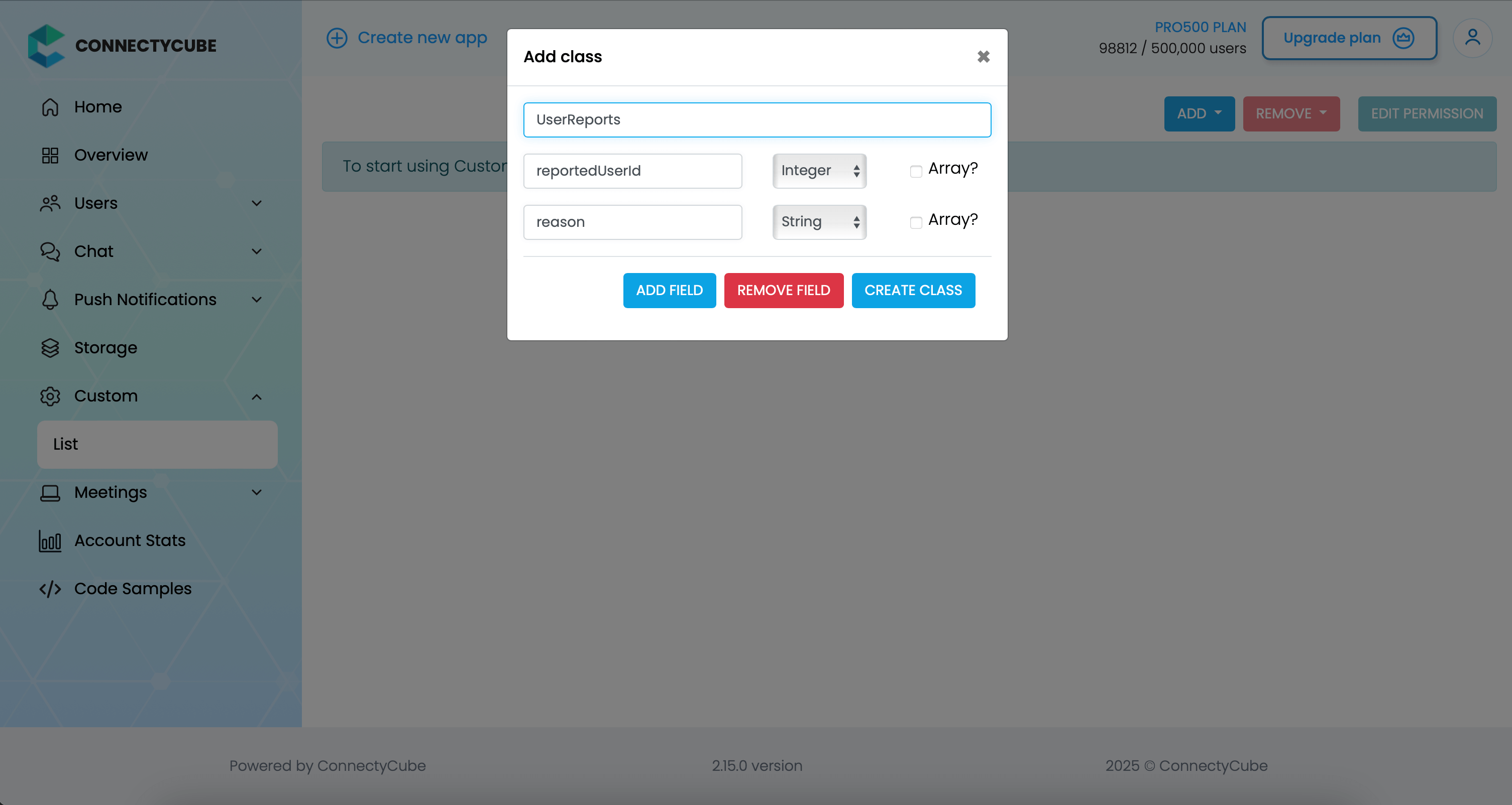
Once the table is created, you can test the user reporting in Widget. You will see the reports appear in this table.
Block user
Section titled “Block user”To enable Block user feature, you need to pass enableBlockList: true prop. This will display a Block button in user profile (see above).
Voice & video calls
Section titled “Voice & video calls”To enable audio and video calling in the chat widget, simply set the enableCalls prop to true:
<ConnectyCubeChatWidget ... enableCalls={true}/>const props = { ... enableCalls: true,};@Component({ ... })export class MyComponent { props = { ... enableCalls: true, };}This will activate the call buttons in the chat UI, allowing users to initiate audio or video calls directly from the widget.
The chat widget comes with advanced AI features to make conversations more effective and personalized.
At then moment the following AI features supported:
- changeMessageTone - adjust the tone of their messages before sending
- textSummarization - instead of scrolling through long chats, users can generate concise summaries of past conversations.
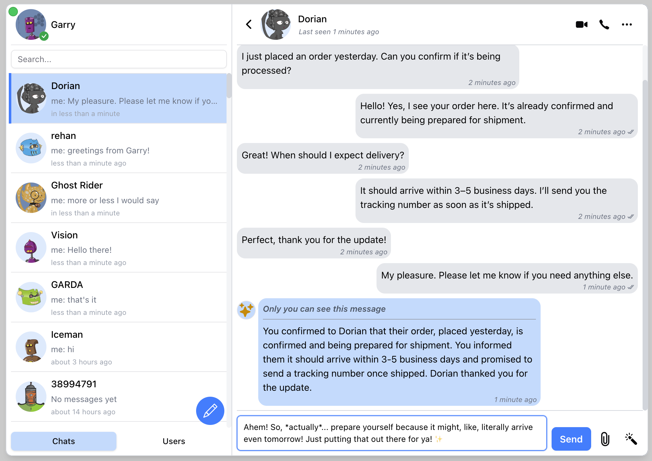
Change message tone
Section titled “Change message tone”Users can adjust the tone of their messages before sending. Whether they want to sound formal, casual, friendly, or professional, the widget helps rephrase messages instantly—ensuring the right style for every context.
<ConnectyCubeChatWidget ... ai={{ changeMessageTone: true, apiKey: 'AIza1231231231231231231231-wHBRQv1M', }}/>const props = { ... ai: { changeMessageTone: true, apiKey: 'AIza1231231231231231231231-wHBRQv1M', },};@Component({ ... })export class MyComponent { props = { ... ai: { changeMessageTone: true, apiKey: 'AIza1231231231231231231231-wHBRQv1M', }, };}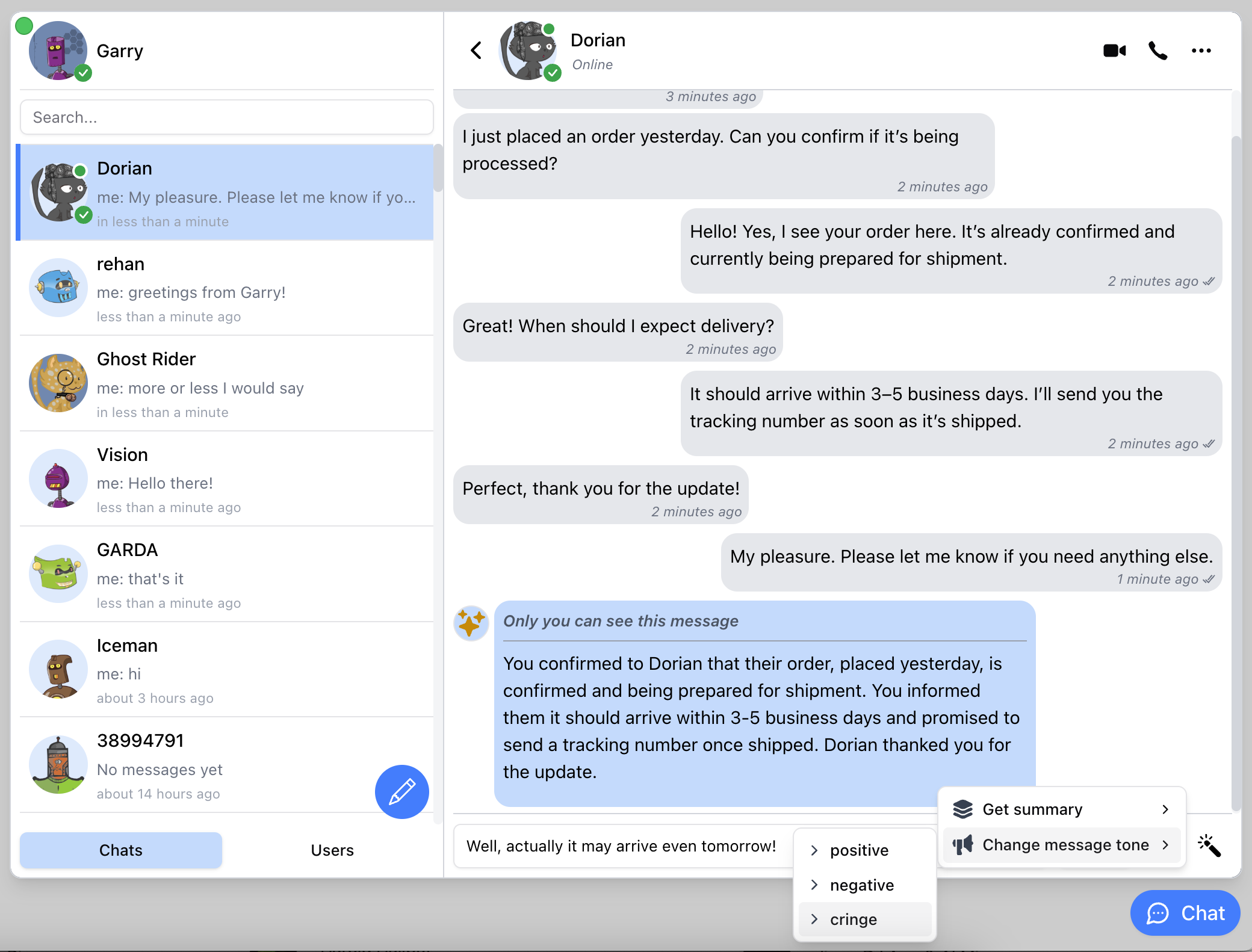
Chat history summarisation
Section titled “Chat history summarisation”Instead of scrolling through long chats, users can generate concise summaries of past conversations. This helps quickly recall key points, decisions, and action items without reading every single message.
<ConnectyCubeChatWidget ... ai={{ textSummarization: true, apiKey: 'AIza1231231231231231231231-wHBRQv1M', }}/>const props = { ... ai: { textSummarization: true, apiKey: 'AIza1231231231231231231231-wHBRQv1M', },};@Component({ ... })export class MyComponent { props = { ... ai: { textSummarization: true, apiKey: 'AIza1231231231231231231231-wHBRQv1M', }, };}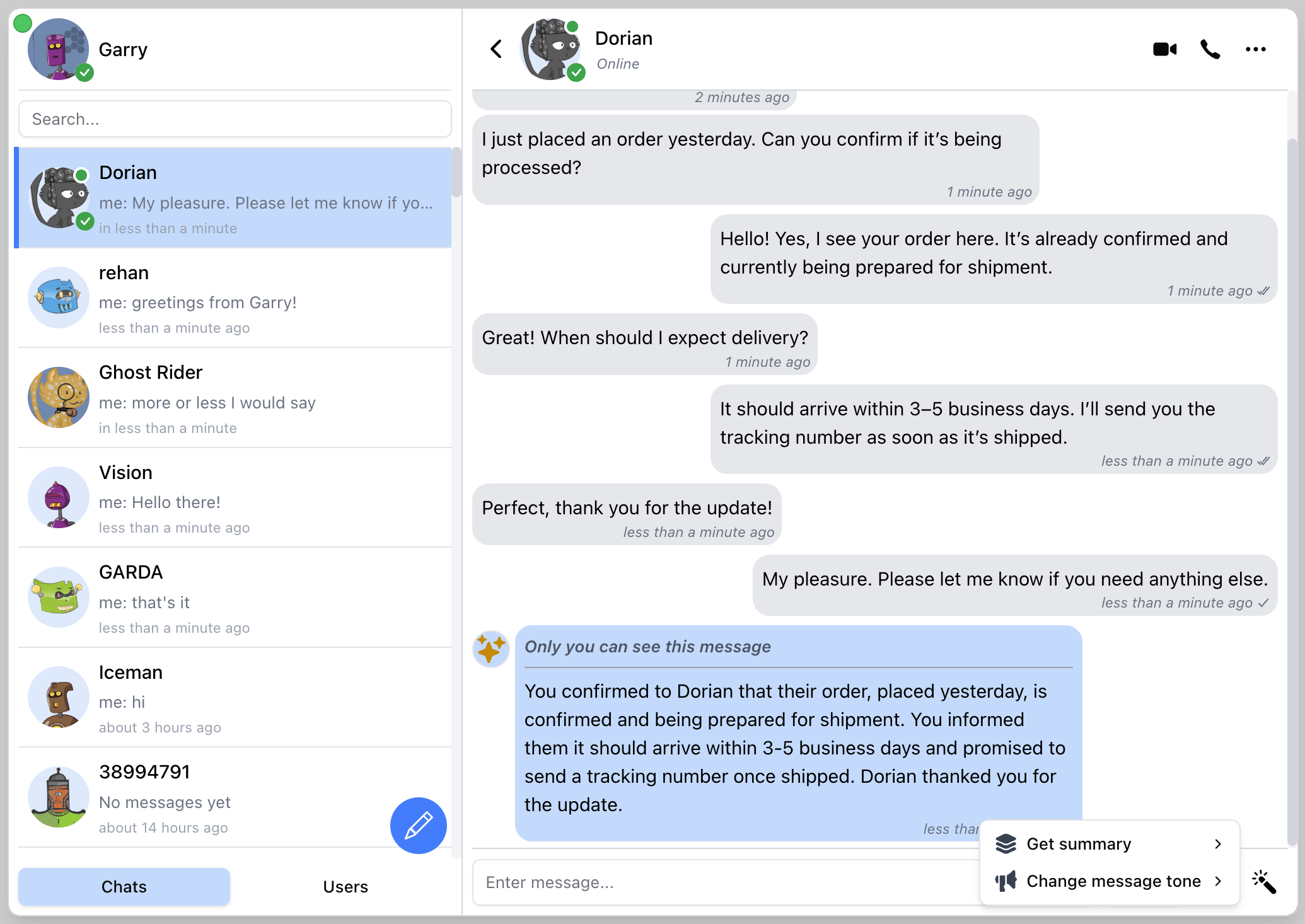
Appearance & Styling
Section titled “Appearance & Styling”The Appearance & Styling settings let you fully customize the visual presentation of the chat widget. You can control the look of the toggle button, badge, and chat portal using inline styles or CSS class names. This ensures your widget blends seamlessly into your app or site design.
Chat toggle button
Section titled “Chat toggle button”- buttonTitle - sets the accessible title (title attribute) of the chat toggle button. This is typically used for accessibility or tooltip text when hovering over the button
- buttonStyle - applies inline styles to the chat toggle button
Portal
Section titled “Portal”- portalStyle - applies inline styles to the main chat window (portal)
- badgeStyle - applies inline styles to the notification badge that appears on the toggle button (e.g., unread messages count)
| Prop Name | Type | Description | Default Value |
|---|---|---|---|
appId | number | string | The ConnectyCube Application ID | |
authKey | string | The ConnectyCube Authentication Key | |
config | object | (Optional) Configuration options for ConnectyCube SDK | |
userId | string | A User Id from your system | |
userName | string | User name. This is how other users will see your user name | |
userEmail | string | (Optional) User email | |
userAvatar | string | (Optional) User Avatar URL | |
userProfileLink | string | (Optional) User profile link URL | |
enableUserLogin | boolean | (Optional) Enables user login/register feature | false |
translation | string | (Optional) Specifies the language for the chat widget. See Supported Translations | ”en” |
disableClickOutside | boolean | (Optional) Hide chat widget by click or touch outside the widget’s containers | false |
disableEscKeyPress | boolean | (Optional) Hide chat widget by press “Escape” button | false |
hideWidgetButton | boolean | (Optional) Allows to hide the button that opens/hides the chat widget | false |
buttonTitle | string | (Optional) Accessible title (title attribute) of the chat toggle button | ”Chat” |
portalStyle | React.CSSProperties | (Optional) Inline styles for the portal | |
overlayStyle | React.CSSProperties | (Optional) Inline styles for the overlay | |
buttonStyle | React.CSSProperties | (Optional) Inline styles for the button | |
badgeStyle | React.CSSProperties | (Optional) Inline styles for the unread messages badge | |
onlineBadgeStyle | React.CSSProperties | (Optional) Inline styles for the online users count badge | |
open | boolean | (Optional) To control the visibility state of the chat widget | false |
embedView | boolean | (Optional) Embeds chat view by filling parent block. Props open and hideNewChatButton won’t react and will be true by default | false |
splitView | boolean | (Optional) Displays the widget in split view (chats list and chat) or mobile view (only chats list or active chat) | false |
singleView | boolean | (Optional) Enables customer support mode, allowing direct chat between users and product support teams. | false |
showChatStatus | boolean | (Optional) Displays the chat connection status indicator | false |
showChatActionsAsMenu | boolean | (Optional) Toggle chat header actions as menu or icon buttons. Default is true | true |
showOnlineUsersTab | boolean | (Optional) Displays users tab with the list of online users | false |
hideNewChatButton | boolean | (Optional) Allows to hide the chat creation button | false |
hideNewUserChatOption | boolean | (Optional) Allows to hide the New Message option in New Chat dropdown | false |
hideNewGroupChatOption | boolean | (Optional) Allows to hide the New Group option in New Chat dropdown | false |
imgLogoSource | string | (Optional) Allows to use custom logo source that is a relative path to the site’s index.html | ”/logo.png” |
muted | boolean | (Optional) Mutes or unmutes notifications and sounds | false |
showNotifications | boolean | (Optional) Allows receiving browser notifications | false |
playSound | boolean | (Optional) Enables or disables playing sound on incoming messages | true |
webPushNotifications | boolean | (Optional) Allows receiving browser push notifications | false |
webPushVapidPublicKey | string | (Optional) Vapid Public Key for push notifications | |
serviceWorkerPath | string | URL | (Optional) Path or URL to service worker for push notifications | |
attachmentsAccept | string | (Optional) Sets the accept attribute for file input (e.g. image/*, .pdf). See HTML input accept. Set to disable/hide attachment button | ”*/*“ |
enableCalls | boolean | (Optional) Enables the calls feature | false |
enableUserStatuses | boolean | (Optional) Enable user statuses, such as “Available”, “Busy” and “Away” | false |
enableLastSeen | boolean | (Optional) Displays green dot on user avatar in chats list when user is online and last seen information on chat header | false |
enableContentReporting | boolean | (Optional) Enable reporting bad content feature (will show Report button in user profile) | false |
enableBlockList | boolean | (Optional) Enable block user feature (will show Block button in user profile) | false |
enableOnlineUsersBadge | boolean | (Optional) Displays online users badge on chat widget button | false |
getOnlineUsersInterval | number | (Optional) How frequently the online users badge is updated, in seconds. Min is 30 | 300 |
enableUrlPreview | boolean | (Optional) Allows to unfurl a link once posted in chat | false |
limitUrlsPreviews | number | (Optional) Maximum displayed URL previews in a single message. Max is 5 | 1 |
singleViewChat | object | (Optional) Launch in support chat mode. Requires singleView and Quick Actions. See Single View Chat | |
termsAndConditions | string | (Optional) Link for “Terms and Conditions” shown in the confirm email form when singleView is enabled. | |
quickActions | object | (Optional) Configuration for quick actions dialog. See Quick Actions | |
defaultChat | object | null | (Optional) Force widget to open a particular chat. See Default Chat | |
ai | object | (Optional) AI options: chat summary, change message tone. See AI | |
onMessageBeforeSend | (body: string) => string | (Optional) Callback to modify the message text before it is sent to the server. Return the modified string. | |
onMessageBeforeDisplay | (body: string) => string | (Optional) Callback to modify the message text when displaying (for received messages). Return the modified string. | |
onUnreadCountChange | (count: number) => void | (Optional) Callback with unread messages count | |
onOnlineUsersCountChange | (count: number) => void | (Optional) Callback with online users count | |
onOpenChange | (open: boolean) => void | (Optional) Callback when chat widget visibility changes |
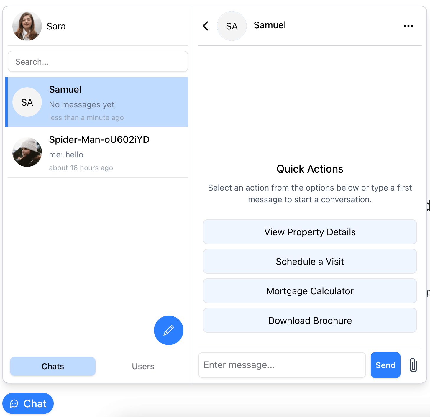
Quick Actions
Section titled “Quick Actions”| Prop Name | Type | Description |
|---|---|---|
title | string | (Optional) Title for the quick actions section |
description | string | (Optional) Description for the quick actions |
actions | string[] | List of action strings |
Supported Translations
Section titled “Supported Translations”| Language Code | Language |
|---|---|
en | English |
el | Greek |
ua | Ukrainian |
es | Spanish |
Default Chat
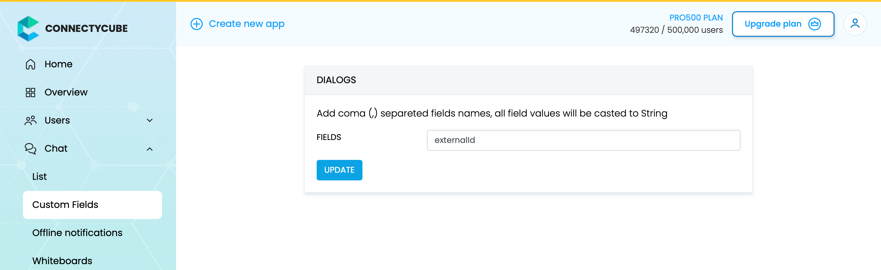
Section titled “Default Chat”Before start working with Default Chat feature, make sure that you have created required externalId custom field in your ConnectyCube Dashboard.
Prop Name | Type | Description |
|---|---|---|
id | string | A key that will be used to identify the chat. Must be same value for each particular user between page reloads. |
opponentUserId | string | User id to create chat with. Must be a User Id from your system, similar to userId prop |
type | string | Type of chat to create if not exist: 1on1 or group |
name | string | Name of chat |
metadata | map | Chat metadata |
Single View Chat
Section titled “Single View Chat”| Prop Name | Type | Description |
|---|---|---|
externalId | string | (Optional) Custom dialog ID for support chat (e.g. for consistent chat identity across sessions) |
opponentUserIds | string | string[] | Opponent(s) ID/IDs for a support chat. Use separators or array of strings. Must be User Id(s) from your system, similar to userId prop |
name | string | (Optional) Name of support chat |
photo | string | (Optional) Photo of support chat. Relative path to an image file, a URL, or ConnectyCube file’s UID |
Push notifications
Section titled “Push notifications”Push notifications allow to receive a message while the browser tab with widget is closed.
For push notifications to work it need to do the following:
- pass
webPushNotifications: trueprop - go to ConnectyCube Dashboard, Push Notifications, Credentials, WEBPUSH NOTIFICATIONS and fill all the required fields (Subject, PublicKey, PrivateKey)
- for
webPushVapidPublicKeyprop to set the same PublicKey which you set in ConnectyCube Dashboard. - create a service worker and provide path to it via
serviceWorkerPathprop. See chat widget code samples as a reference.
| Prop Name | Type | Description |
|---|---|---|
apiKey | string | An GOOGLE_GENERATIVE_AI_API_KEY for Google AI “gemini-2.5-flash” model. Register here https://aistudio.google.com/u/2/apikey |
textSummarization | boolean | (Optional) Activates the ability to get a summary of a conversation for the selected time period |
changeMessageTone | boolean | (Optional) Allows the ability to change the tone of a typed message to “positive”, “negative”, or “cringe” |
Recipes
Section titled “Recipes”Split view
Section titled “Split view”To display a widget with 2 separate UI blocks: left for chats list and the right one for messages stream.
<ConnectyCubeChatWidget ... splitView={true}/>const props = { ... splitView: true,};@Component({ ... })export class MyComponent { props = { ... splitView: false, };}
Mobile view
Section titled “Mobile view”To display a widget with 1 UI block, which displays chats list and once selected a chat - it will display the messages stream.
<ConnectyCubeChatWidget ... splitView={false}/>const props = { ... splitView: false,};@Component({ ... })export class MyComponent { props = { ... splitView: true, };}
Embedded view
Section titled “Embedded view”To embed the widget onto a page and display it e.g. full screen.
<ConnectyCubeChatWidget ... embedView={true}/>const props = { ... embedView: true,};@Component({ ... })export class MyComponent { props = { ... embedView: true, };}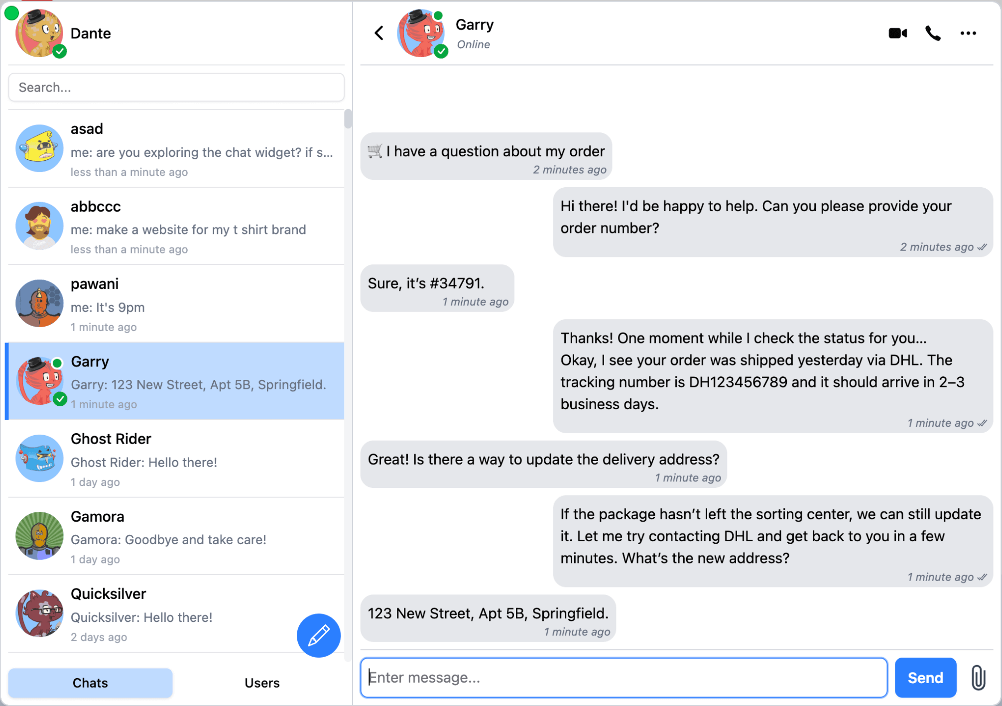
Single View
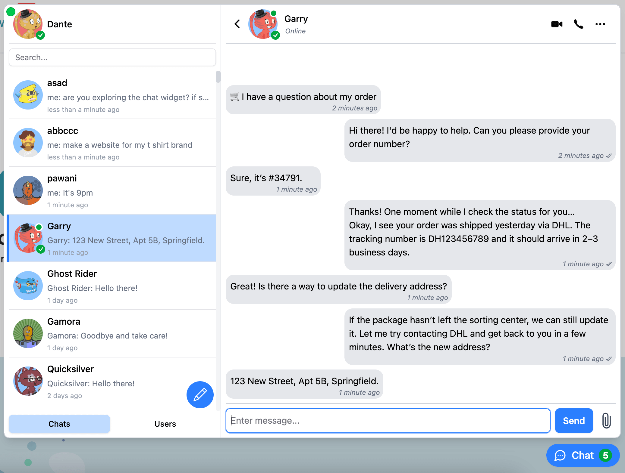
Section titled “Single View”To display a widget in a single view mode - most popular for support chat use case.
<ConnectyCubeChatWidget ... singleView={true} termsAndConditions='https://cats-store.com/terms-and-conditions' singleViewChat={{ name: 'Cats Store', photo: 'https://cataas.com/cat', opponentUserIds: ['cat_support#007', 'cat_support#069'], }} quickActions={{ title: 'Quick Actions', description: 'Select an action from the options below or type a first message to start a conversation.', actions: [ '🛒 I have a question about my order', '💳 I need help with payment or billing', '⚙️ I’m having a technical issue', '❓ Something else – connect me to support', ], }}/>const props = { ..., singleView: true, termsAndConditions: 'https://cats-store.com/terms-and-conditions', singleViewChat: { name: 'Cats Store', photo: 'https://cataas.com/cat', opponentUserIds: ['cat_support#007', 'cat_support#069'], }, quickActions: { title: 'Quick Actions', description: 'Select an action from the options below or type a first message to start a conversation.', actions: [ '🛒 I have a question about my order', '💳 I need help with payment or billing', '⚙️ I’m having a technical issue', '❓ Something else – connect me to support', ], },};@Component({ ... })export class MyComponent { props = { ..., singleView: true, termsAndConditions: 'https://cats-store.com/terms-and-conditions', singleViewChat: { name: 'Cats Store', photo: 'https://cataas.com/cat', opponentUserIds: ['cat_support#007', 'cat_support#069'], }, quickActions: { title: 'Quick Actions', description: 'Select an action from the options below or type a first message to start a conversation.', actions: [ '🛒 I have a question about my order', '💳 I need help with payment or billing', '⚙️ I’m having a technical issue', '❓ Something else – connect me to support', ], }, }}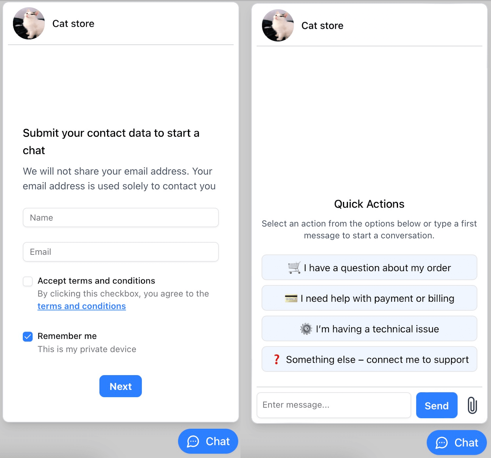
Display Chat button bottom left
Section titled “Display Chat button bottom left”<ConnectyCubeChatWidget ... buttonStyle={{"left": "0.5rem", "right": "auto"}} portalStyle={{"left": "0.5rem", "right": "auto"}}/>const props = { ... buttonStyle: {"left": "0.5rem", "right": "auto"} portalStyle: {"left": "0.5rem", "right": "auto"},};@Component({ ... })export class MyComponent { props = { ... buttonStyle: {"left": "0.5rem", "right": "auto"} portalStyle: {"left": "0.5rem", "right": "auto"}, };}Open widget on custom button
Section titled “Open widget on custom button”import { useState } from 'react';import { ConnectyCubeChatWidget } from '@connectycube/chat-widget';
export default function App() { const [visible, setVisible] = useState(false);
return ( <div> <button onClick={() => setVisible((prevState) => !prevState)}> {visible ? 'Close' : 'Open'} </button>
<ConnectyCubeChatWidget ... open={visible} /> </div> );}const openChatBtn = document.getElementById('openChatButton');openChatBtn.addEventListener('click', () => { window.ConnectyCubeChatWidget.toggle()});@Component({ ... })export class MyComponent { props = { ..., open: false, };
toggleVisible() { this.props = { ...this.props, open: !this.props.open }; }}in template:
<div>  <button (click)="toggleVisible()">    {{ props.open ? 'Close' : 'Open' }}  </button>
  <connectycube-chat-widget [props]="props" /></div>
Have an issue?
Section titled “Have an issue?”Join our Discord for quick answers to your questions
Changelog
Section titled “Changelog”https://github.com/ConnectyCube/connectycube-chat-widget-samples/blob/main/CHANGELOG.md